
Liberty Latin America’s acquisition of telecommunications companies across the Caribbean and Latin America highlighted the need for a unified design approach. This led to the creation of Wave, a global design system that connects all companies in the group digitally, streamlining workflows and improving decision-making across markets. Wave is designed to enhance collaboration, creating a seamless experience for users in every country.

This fragmentation led to implementation errors, slow delivery times, and a poor user experience. From a business perspective, the goal was to scale efficiently, reduce costs, and optimize development cycles, ultimately increasing the value delivered over time.

Our Response: The Wave Design System
The solution was to design Wave from scratch, drawing inspiration from Material Design and other leading industry standards. The MVP focused on a pilot market, where we built an end-to-end online purchasing experience, prioritizing the "happy path" of the contracting flow. This pilot helped us validate decisions, reduce risk, and lay the foundation for a scalable and cross-functional system.
Expansion Strategy
Following the initial success, we designed a phased roadmap to progressively migrate the +20 markets under centralized governance. This approach allowed us to consolidate a single source of truth, improve quality, reduce operational costs, and strengthen collaboration across design, development, CRO, eCare, and Service Design teams, alongside international contractors based in India and the U.S.

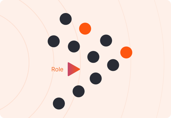
As Design System Lead, I was responsible for orchestrating the creation, scalability, and governance of Wave across 20+ markets. I led a multidisciplinary team of UX and UI professionals, guiding the design of core components based on a primary market and ensuring their adaptability across regional contexts. My role combined strategic leadership driving alignment, visibility, and adoption of the system throughout the organization with hands-on contribution, especially in building, validating, and evolving components. I also led the squad of UI co-creators, ensuring proper maintenance and documentation practices. A key part of the process was early and continuous collaboration with development teams, incorporating technical feedback into design decisions and defining interaction models that respected both user needs and implementation feasibility.
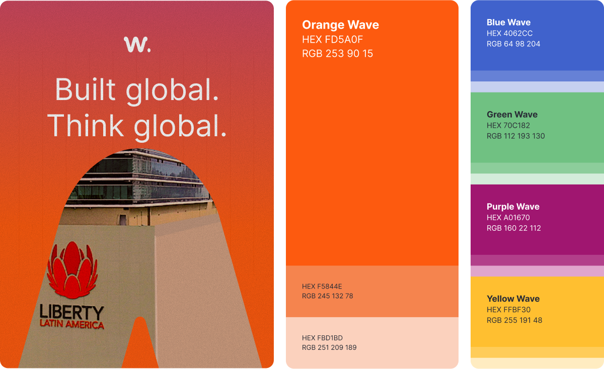
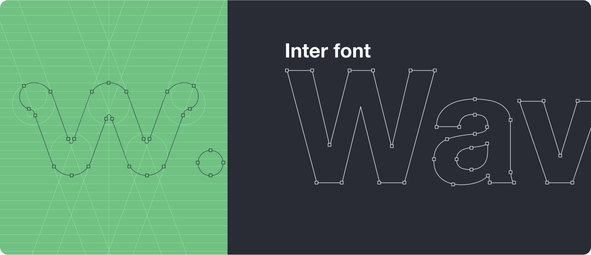
As part of the system’s foundation, we developed a dedicated brand identity for Wave positioning it as its own product and enabling a smoother, more organic transition across the +20 brands and markets. Treating Wave as a "meta-brand" allowed us to build recognition, trust, and consistency internally and externally.
This branding effort ensured that Wave was not only a set of components, but a recognizable and adoptable design language backed by its own visual narrative.

We adhere to foundational principles that shape and guide every element we create. Consistency ensures a harmonious appearance, accessibility guarantees seamless interaction for all, flexibility allows us to adapt to diverse contexts, and placing the user first guides us in crafting impactful experiences. Join me on a journey through these pillars that uphold the design system and define the essence of all Liberty creations.
Our design system is user-focused on real people and their needs, ensuring that every component, pattern, and guideline is crafted with empathy and accessibility in mind.
We create products that are accessible to all users, regardless of ability or situation ensuring everyone can use and benefit from them.
We prioritize consistency to ensure a cohesive and familiar user experience, building trust and making our products easier to use.
With modular and scalable components, teams can easily customize and build upon our system without sacrificing consistency.
Orange is the core of Wave’s visual identity chosen for its energy, creativity, and alignment with Liberty Latin America’s brand. It serves as the primary color across all design elements, unifying the system and reinforcing a recognizable personality. More than just a hue, orange represents vitality and accessibility, anchoring every interaction with Wave. Complementary colors (used in 20% of the system) support versatility and balance, helping create gradients, icons, and highlights that reflect Wave’s dynamic, professional character while staying true to LLA’s brand essence.

We kicked off with a comprehensive discovery phase that included design audits, usability testing, stakeholder workshops, competitive analysis, and benchmarking. These efforts allowed us to identify key UX issues, align on opportunities, and inform system design grounded in real user needs and business priorities.
To define the MVP, we diagnosed and mapped the most frequently used components within the pilot market’s end-to-end eCommerce flow. We applied an impact/effort matrix to prioritize which elements to build first, ensuring maximum return while avoiding premature complexity.
How we prioritize "way"


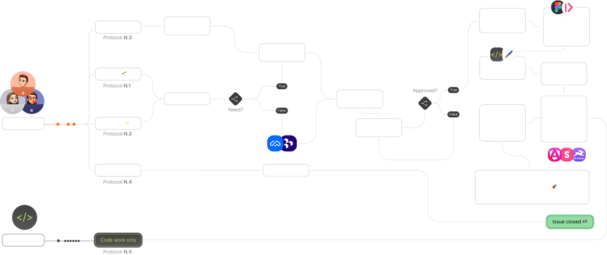
Design & Dev Collaboration
Collaboration between design and engineering followed a structured workflow with clear checkpoints including refinements, sprint planning, and demos. We defined a shared Way of Work that detailed delivery standards, validation responsibilities, and component release protocols.
Validation & Iteration
Each component was informed by usability testing insights from the eCommerce design track. When regional needs emerged, we either adapted components with conditional variations or rarely created exclusive ones, maintaining scalability as a guiding principle.
Tools & Governance
We used Jira for day-to-day tracking, Figma for design and documentation, Storybook as the dev-facing source of truth, and Zeroheight to make the system visible and usable by stakeholders and regional teams. As Design System Lead, I oversaw governance, aligned updates with Technical Product Owners, and managed the system roadmap.
Release & Maintenance
Wave operated on biweekly sprints, with a shared backlog driven by business needs and product NSMs. Continuous iteration and validation ensured the system evolved without sacrificing alignment, efficiency, or design integrity.
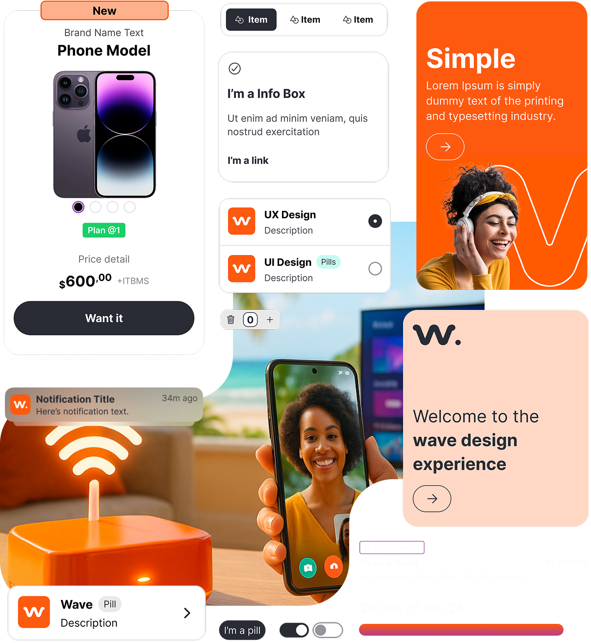
We have crafted a large number of functional, editable and responsive components that will help to display the desired information in any design.
We have in detail the number of components that our designers have used, this information helps us to know the importance of the use of the components.

156
Tokens
70
Icons
7
Patterns
+20
Markets
20+ countries throughout Caribbean and Latam
To improve the findability and organization of the components, we worked in categories to group and define the functionality of each one of them.

Base

Banner

Data Display

Data Entry

Feedback

Layout and structure

Navigation

Patterns

Scalability
20+ countries throughout Caribbean and Latam

Adoption
18 teams and a 100% of adoption.

User interface design consistency
Same foundations, same components and diferent brands applied. One base market like to reference and set consistency to 20+ additional ones.

Component used across products
1.5k components used across all teams and products with 1.8k styles integrated and 156 tokens applied.
Tech debt
We centralize all types of technical debt in order to attack it in the most efficient way possible.
Contributions to the Design System
Three tracks of projects aligned and sync to value and contribuiting to the system.
Documentation Visits
Every human being in the company uses our doc.
Design debt
We constantly evaluate our libraries
95 components
Between, components and desing patterns. Now the focus is improve the important ones.
88 Libraries
One library per component. Sounds crazy, right? Well, we manage all design documentation and library to improve updates, manage dependencies, file sizes and make available just the components to need it.
Design to Development Time (Handoff)
Working faster with spcials libraries to document and begin from templates.
Navigating Global Complexity
One of the most valuable lessons was understanding the vast difference between managing a local vs. a global Design System. Leading across regions demanded strategic governance, strong stakeholder alignment, and the ability to foster motivation and resilience through constant change. Creating a shared sense of ownership between design, development, and product teams was critical.
Technical Debt & Roadmap Pressure
One of the most complex challenges was dealing with inherited technical debt while navigating sales-driven roadmaps. This taught us to aim for excellence in delivery, not just speed—prioritizing quality early to avoid future rework.
Expectation Management
A key takeaway was the importance of clearly defining product stages. Prioritizing time to market over QA created misaligned expectations and technical friction. Going forward, structured phasing and validation checkpoints would be essential.
Unfinished Tracks & New Horizons
Some smaller markets remained pending integration, and while design tokens were defined and structured by the design team, they weren’t fully implemented in code. Additionally, the rapid growth of the team scaling junior roles into more senior ones opened the door for a more mature design culture.
Strategic Outlook
To ensure long-term scalability and business alignment, the next evolution of the system should focus on:
- Tokenization at scale, tightly integrated between design and code.
- Cross-platform systemization, bridging native and web experiences.
- DesignOps maturity, embedding rituals, tooling, and metrics into the team's DNA.
- Measuring business impact, linking system usage with KPIs like NPS, conversion, or product delivery velocity.
- Community-led contribution models, empowering regional teams to co-own and evolve the system responsibly.
